Smart Girls Get What They Want by Sarah Strohmeyer
The original cover was lovely: bright blue background, full-body model, great contrast between sans serif author font and handwritten title font. Then the paperback: overload of pink, really awkward model positioning with typical hiding-of-face, generic outdoor background. Just... WHY. Why would they take a book about being smart and turn it so generic?


The Juliet Club by Suzanne Harper
Close-ups of fabric are far less common than one would think. Close-ups of girls' faces, however, are far more common than one would like, and so is a guy's shoulder in the frame to say HINT HINT ROMANCE, and so is that atrocious bubbly script font. Oh my God, and that tagline. "Which letter will open her heart?" *gag*


Transparent by Natalie Whipple
I cannot get over this transition. The hardcover is so lovely — the blur of colours, the faint outlining/masking, the glow of the title letters. And then the paperback. It's so tacky. I can't even. I mean, yay for glasses on a YA protag?
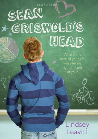

Sean Griswold's Head by Lindsey Leavitt
Not a huge fan of the original, but wow is that paperback worse. The sticker-like application of the title makes this look like a piece of produce, and that awkward pose of the models is exacerbated by the diagonal tilting of the photo. And again, generic outdoor background, yay.
Wow! That was a lot of negativity. But seriously, how do paperbacks get so terrible that I feel compelled to post about them? I think I'll have to do a cover love post in the near future, just to restore my faith in YA transitional covers.